Triafly
Redesign of a low-code platform for automating analytical processes.
SaaS
BI
B2B
Company
Triafly
Role
Product Designer
Triafly is a Russian low-code platform for automating analytical processes.
Key points
I redesigned Triafly's key scenarios to simplify working with a complex BI platform, reduce users' reliance on support, and lay a systematic foundation for product development.
Initial situation
Triafly developed for many years without a product designer: new features were added as needed, resulting in accumulated UX and technical debt, and the interface became complex and inconsistent. Some issues were offset by customisation during implementation and support work, making it difficult for users to independently master the platform and solve everyday tasks.
Problems

Users found it difficult to work with the product independently — the interface was complex to learn, and out-of-the-box scenarios were insufficient. As a result, onboarding could take months, and users depended on support even for basic tasks. This increased maintenance costs and hindered product scaling.
The interface did not consider different roles and work scenarios — all users entered the same workspace regardless of their tasks, and several functional modules could be combined on one screen. This complicated navigation and forced users to understand functions unrelated to their current task.
Accumulated design debt hindered systematic product development — over years without a designer, the product lacked unified UX/UI patterns and a systematic approach to interfaces. This led to visual and behavioural inconsistency and complicated new feature design.
Constraints
Limited user access
There was almost no direct access to end users, so regular interviews and usability tests were not possible. The main sources of requirements were the product owner, system analyst, and technical specifications.
Significant technical debt
The product had developed over many years, so new solutions had to be designed considering existing architecture, technical dependencies, and already implemented functionality.
What I changed
Made role and access management more transparent
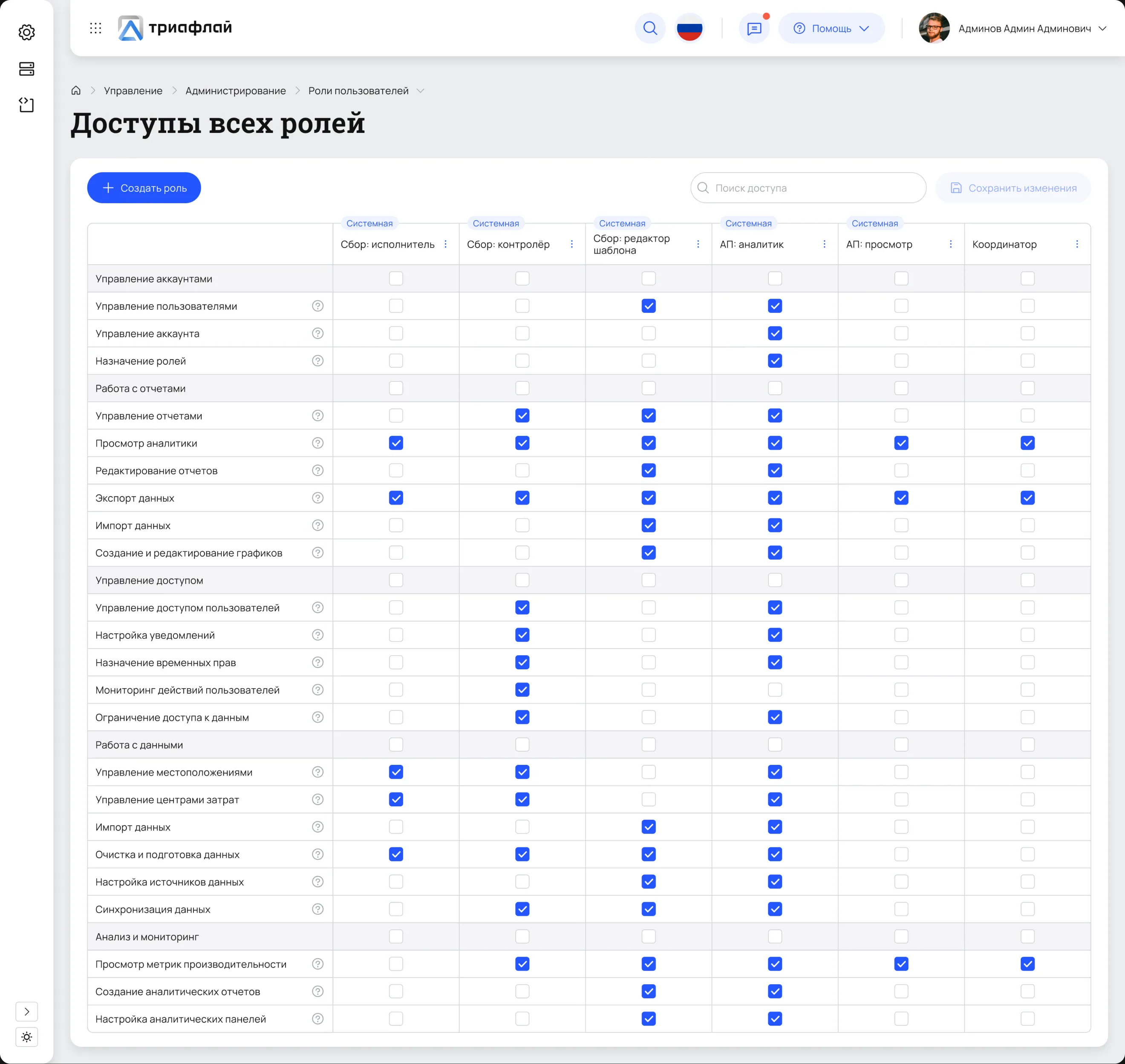
Managing a large number of roles and permissions was difficult to control and verify. I consolidated access rights into a single matrix so the administrator could see the entire structure, compare roles, and modify permissions within one workspace. As a result, setting up and checking access became possible in a unified view without switching between separate settings.
Simplified the creation of visualisations
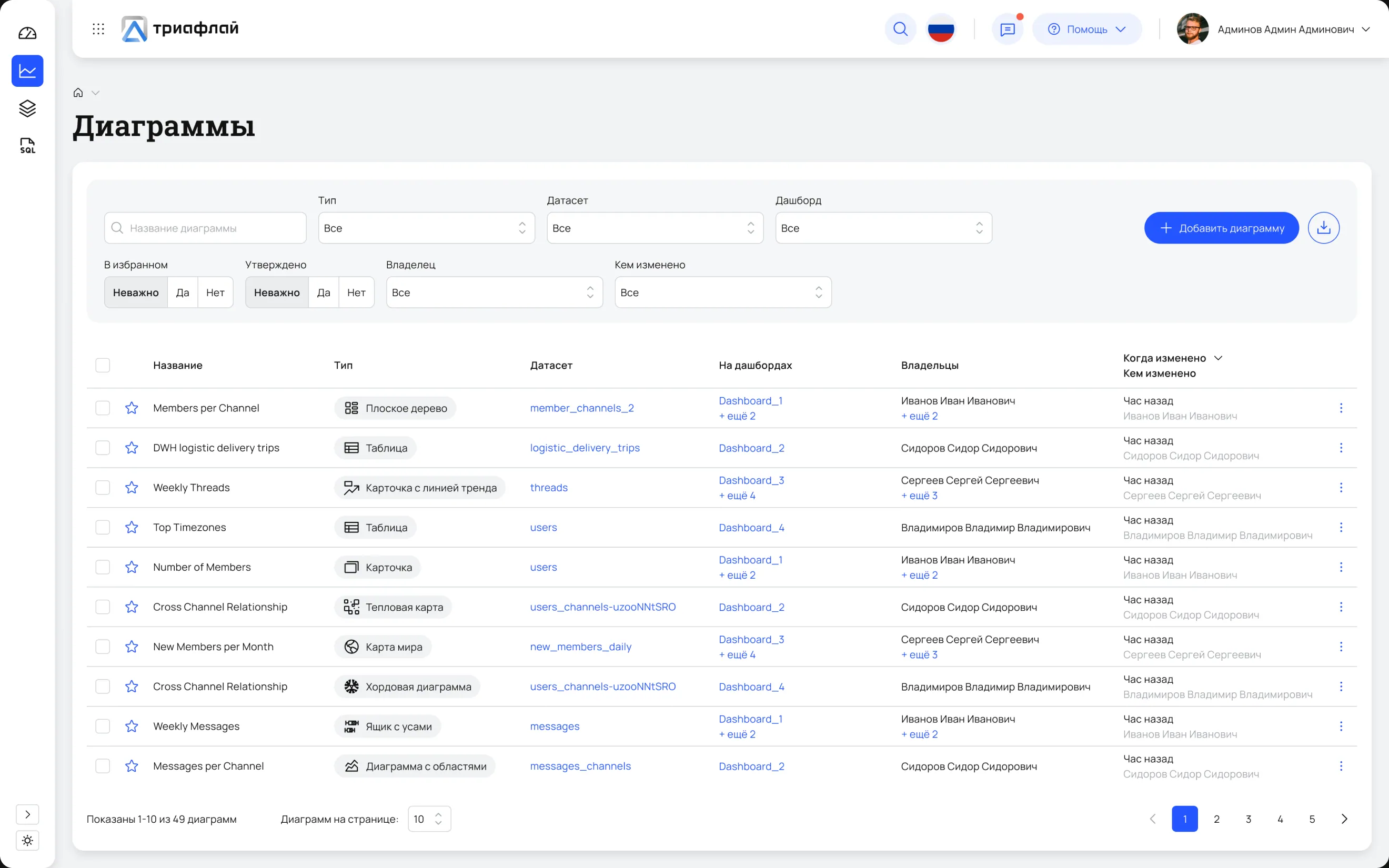
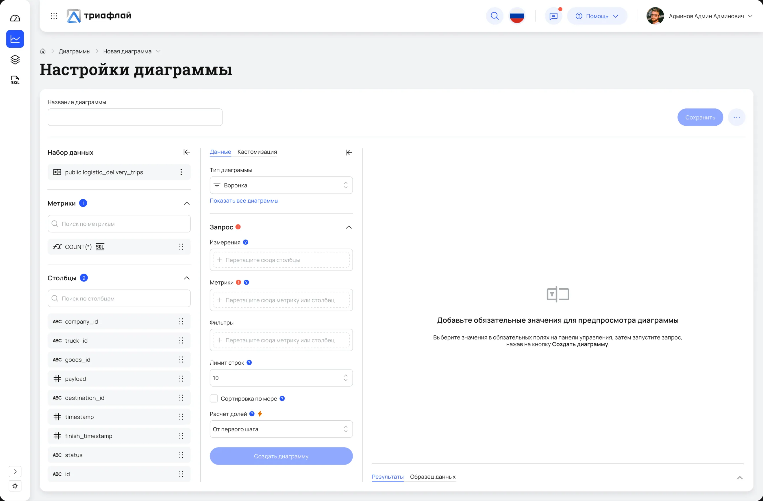
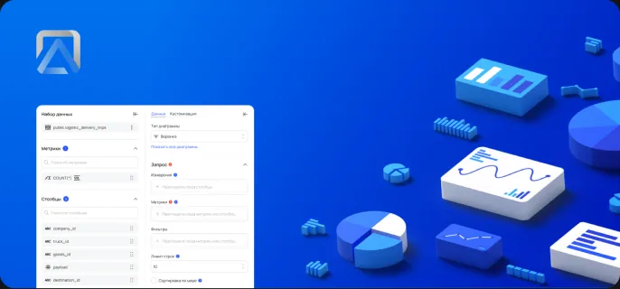
Designed a unified workspace where the user can select a data source, configure metrics, dimensions, and filters, and build a chart within a single workflow.
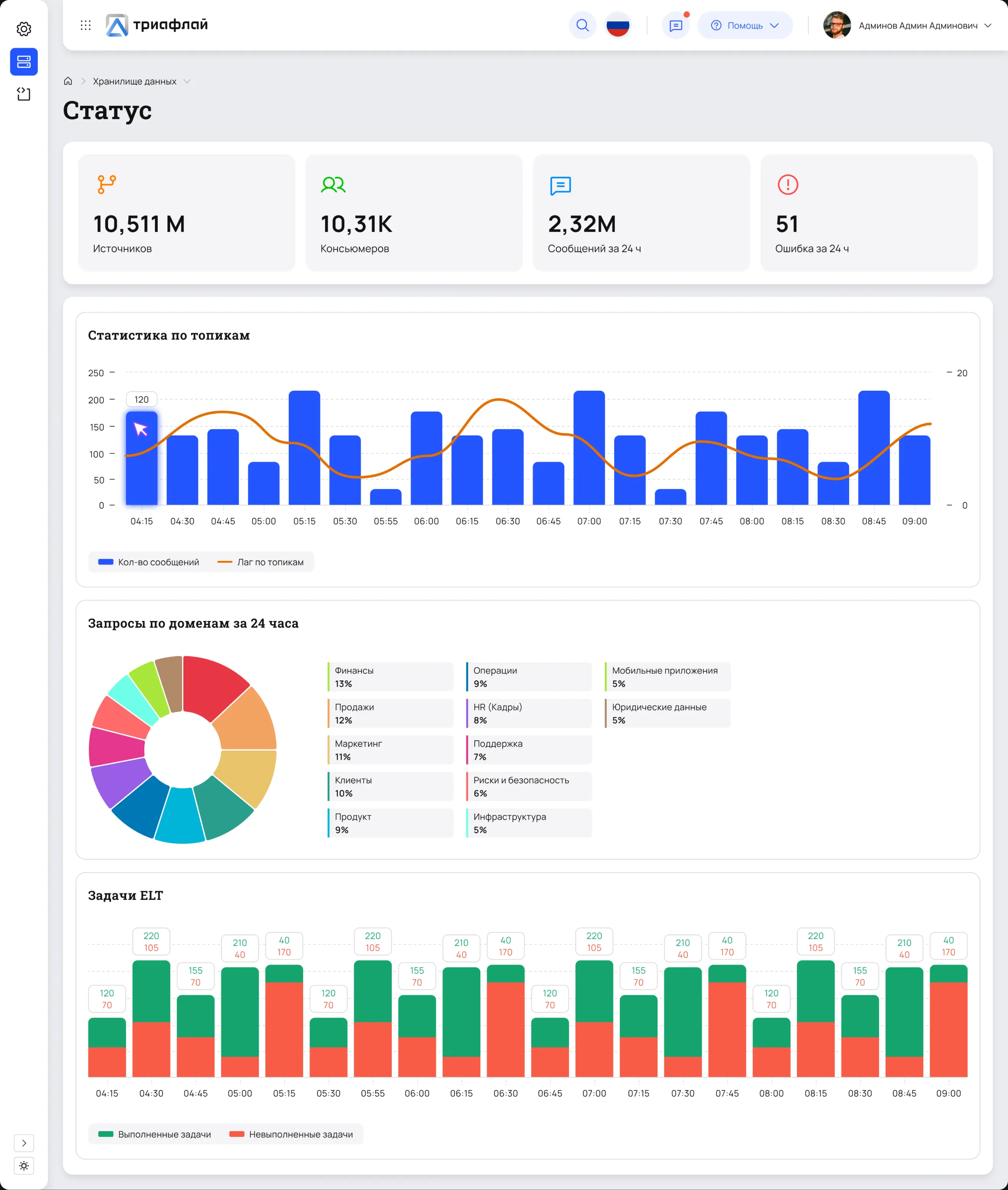
Simplified system status monitoring
Combined key metrics, ELT task status, and load on one screen so the user can quickly assess system health and identify where to look for the source of a problem.
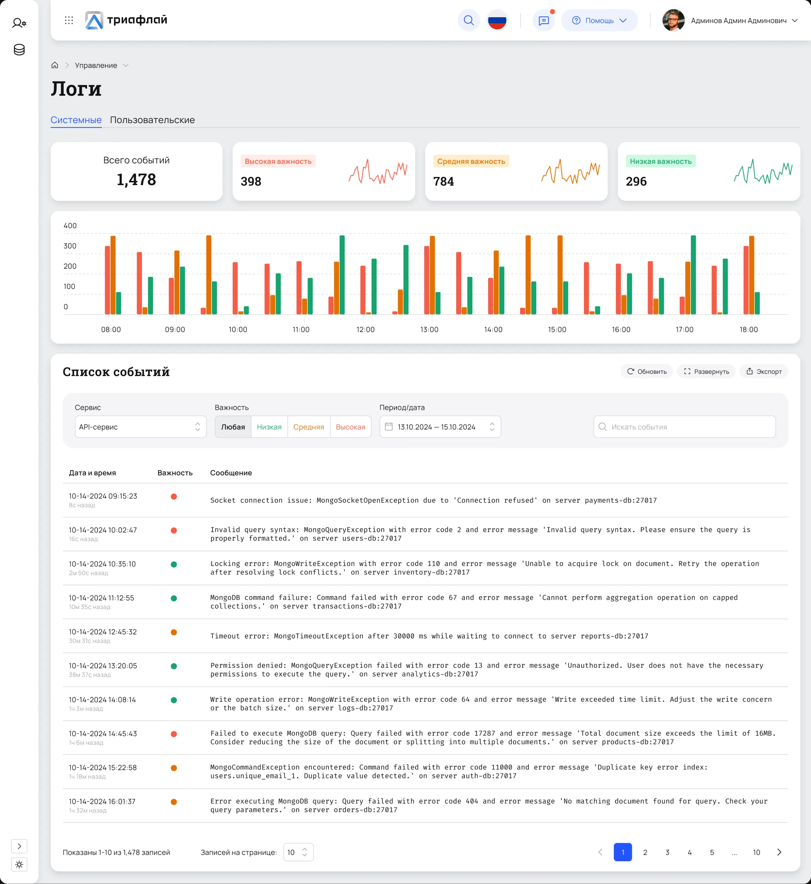
Simplified error searching in logs
Consolidated system events on one screen and added filters by service, severity, and date, enabling the user to find relevant errors faster and understand the causes of failures.
Created a design system
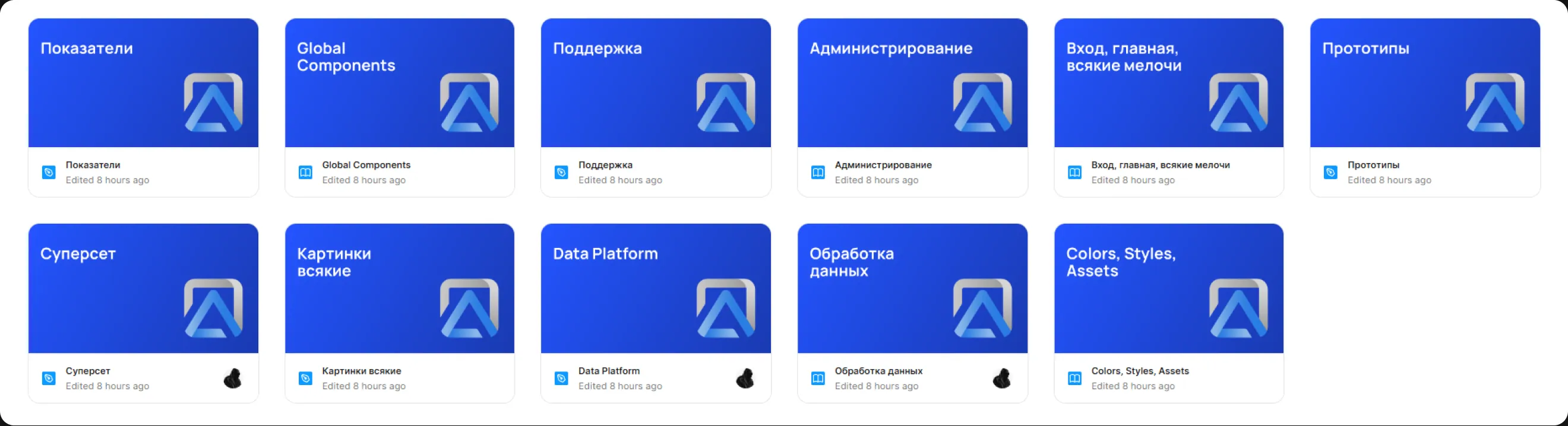
To prevent new interfaces from increasing design debt, I built a design system from scratch with global and local components, colour and typography tokens, styles, and assets. It became a shared foundation for designing new workflows and maintaining product consistency.
Result
As a result, the key scenarios gained a more consistent structure, and the product acquired unified UX/UI patterns and a design system. This created a foundation for further interface development without the constant accumulation of new fragmented solutions.
Triafly
Redesign of a low-code platform for automating analytical processes.
SaaS
BI
B2B
Company
Triafly
Role
Product Designer
Triafly is a Russian low-code platform for automating analytical processes.
Key points
I redesigned Triafly's key scenarios to simplify working with a complex BI platform, reduce users' reliance on support, and lay a systematic foundation for product development.
Initial situation
Triafly developed for many years without a product designer: new features were added as needed, resulting in accumulated UX and technical debt, and the interface became complex and inconsistent. Some issues were offset by customisation during implementation and support work, making it difficult for users to independently master the platform and solve everyday tasks.
Problems
Users found it difficult to work with the product independently — the interface was complex to learn, and out-of-the-box scenarios were insufficient. As a result, onboarding could take months, and users depended on support even for basic tasks. This increased maintenance costs and hindered product scaling.
The interface did not consider different roles and work scenarios — all users entered the same workspace regardless of their tasks, and several functional modules could be combined on one screen. This complicated navigation and forced users to understand functions unrelated to their current task.
Accumulated design debt hindered systematic product development — over years without a designer, the product lacked unified UX/UI patterns and a systematic approach to interfaces. This led to visual and behavioural inconsistency and complicated new feature design.
Constraints
Limited user access
There was almost no direct access to end users, so regular interviews and usability tests were not possible. The main sources of requirements were the product owner, system analyst, and technical specifications.
Significant technical debt
The product had developed over many years, so new solutions had to be designed considering existing architecture, technical dependencies, and already implemented functionality.
What I changed
Made role and access management more transparent
Managing a large number of roles and permissions was difficult to control and verify. I consolidated access rights into a single matrix so the administrator could see the entire structure, compare roles, and modify permissions within one workspace. As a result, setting up and checking access became possible in a unified view without switching between separate settings.
Simplified the creation of visualisations
Designed a unified workspace where the user can select a data source, configure metrics, dimensions, and filters, and build a chart within a single workflow.
Simplified system status monitoring
Combined key metrics, ELT task status, and load on one screen so the user can quickly assess system health and identify where to look for the source of a problem.
Simplified error searching in logs
Consolidated system events on one screen and added filters by service, severity, and date, enabling the user to find relevant errors faster and understand the causes of failures.
Created a design system
To prevent new interfaces from increasing design debt, I built a design system from scratch with global and local components, colour and typography tokens, styles, and assets. It became a shared foundation for designing new workflows and maintaining product consistency.
Result
As a result, the key scenarios gained a more consistent structure, and the product acquired unified UX/UI patterns and a design system. This created a foundation for further interface development without the constant accumulation of new fragmented solutions.
Triafly
Redesign of a low-code platform for automating analytical processes.
SaaS
BI
B2B
Company
Triafly
Role
Product Designer
Triafly is a Russian low-code platform for automating analytical processes.
Key points
I redesigned Triafly's key scenarios to simplify working with a complex BI platform, reduce users' reliance on support, and lay a systematic foundation for product development.
Initial situation
Triafly developed for many years without a product designer: new features were added as needed, resulting in accumulated UX and technical debt, and the interface became complex and inconsistent. Some issues were offset by customisation during implementation and support work, making it difficult for users to independently master the platform and solve everyday tasks.
Problems
Users found it difficult to work with the product independently — the interface was complex to learn, and out-of-the-box scenarios were insufficient. As a result, onboarding could take months, and users depended on support even for basic tasks. This increased maintenance costs and hindered product scaling.
The interface did not consider different roles and work scenarios — all users entered the same workspace regardless of their tasks, and several functional modules could be combined on one screen. This complicated navigation and forced users to understand functions unrelated to their current task.
Accumulated design debt hindered systematic product development — over years without a designer, the product lacked unified UX/UI patterns and a systematic approach to interfaces. This led to visual and behavioural inconsistency and complicated new feature design.
Constraints
Limited user access
There was almost no direct access to end users, so regular interviews and usability tests were not possible. The main sources of requirements were the product owner, system analyst, and technical specifications.
Significant technical debt
The product had developed over many years, so new solutions had to be designed considering existing architecture, technical dependencies, and already implemented functionality.
What I changed
Made role and access management more transparent
Managing a large number of roles and permissions was difficult to control and verify. I consolidated access rights into a single matrix so the administrator could see the entire structure, compare roles, and modify permissions within one workspace. As a result, setting up and checking access became possible in a unified view without switching between separate settings.
Simplified the creation of visualisations
Designed a unified workspace where the user can select a data source, configure metrics, dimensions, and filters, and build a chart within a single workflow.
Simplified system status monitoring
Combined key metrics, ELT task status, and load on one screen so the user can quickly assess system health and identify where to look for the source of a problem.
Simplified error searching in logs
Consolidated system events on one screen and added filters by service, severity, and date, enabling the user to find relevant errors faster and understand the causes of failures.
Created a design system
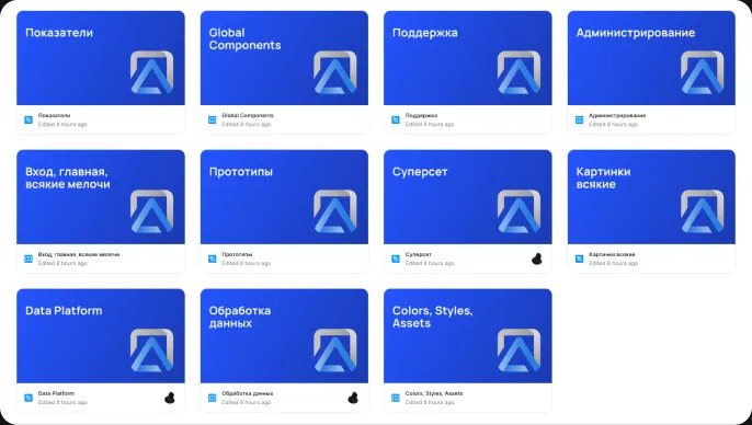
To prevent new interfaces from increasing design debt, I built a design system from scratch with global and local components, colour and typography tokens, styles, and assets. It became a shared foundation for designing new workflows and maintaining product consistency.
Result
As a result, the key scenarios gained a more consistent structure, and the product acquired unified UX/UI patterns and a design system. This created a foundation for further interface development without the constant accumulation of new fragmented solutions.